The Windows Phone 7 Review
by Anand Lal Shimpi & Brian Klug on October 20, 2010 7:00 PM EST- Posted in
- Smartphones
- Windows Phone 7
- Microsoft
- Mobile
OEM/Carrier Customization: One Part Apple, One Part Google
For the past couple of years we’ve had two options at the forefront of the smartphone race. If you want the ability to choose your own device, customize your OS and run virtually anything you want to: Android has you covered. If you want more of an appliance experience and don’t mind giving up freedom in hardware choice or OS customization, there’s always the iPhone. Apple will never sell iOS on non-Apple hardware, and until Android 3.0 Google won’t enforce a consistent UI across all partners. Microsoft falls smack in the middle. If you weren’t totally happy with either option, Windows Phone may be what you’ve been looking for.
The OS and user experience are pretty much off limits for carriers and OEMs to customize. Microsoft will not allow any custom skinning or replacement of default apps. While Android lets you switch out the virtual keyboard software, Microsoft takes a more Apple-like approach and instead delivers what it believes is the only keyboard software you will need. Microsoft wants all Windows Phones to look and feel the same from a UI standpoint, so custom UIs are out. Don’t expect to see HTC’s Sense or Samsung’s TouchWiz permeate Microsoft’s latest OS.
Even hardware specs are pretty well dictated by Microsoft. All first generation Windows Phone 7 devices must use a Qualcomm Snapdragon SoC with Adreno 200 GPU, they must feature at least a 5MP camera and an 800 x 480 screen. A physical keyboard may be optional but all must implement Microsoft’s virtual keyboard via a capacitive multitouch screen.
There are three buttons that must be present along the bottom of the face of any Windows Phone: Back, Start and Search. The buttons must be present in that order, avoiding the confusion of reordered buttons we sometimes see on Android devices. The type of button is up to the OEM to decide: either capacitive touch or physical buttons can be used.
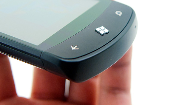
At the top left of any Windows Phone there must be a volume rocker. The top right has to have a power/lock button. The lower right has to have a physical camera button capable of waking the phone up from sleep and putting it directly into the camera app. Microsoft views the smartphone as the replacement for the point and shoot camera and thus Windows Phone needs to be able to function just as quickly as a P&S. Finally, all Windows Phones must have a 3.5” stereo audio out jack and support for headsets with three button integration. These are headsets similar to what Apple ships with the iPhone with button(s) on the cable itself.
Microsoft wants OEMs to compete based on hardware design. Windows Phones can take any shape and size, but they must meet these basic requirements. It’s Microsoft’s way of saying: feel free to differentiate, but don’t ruin what we’ve built.
With this approach Microsoft hopes to avoid the mistakes Google has made with Android, where there’s an inconsistent user experience going from HTC to Samsung to Motorola Android phones. It’s almost as if Microsoft is taking Apple’s approach and simply letting everyone build iPhones.
The OEMs are understandably nervous of what Microsoft is proposing. From what I’ve heard, Google is putting a lot of pressure on its partners to remain pro-Google. That combined with Microsoft’s unproven track record in this new smartphone world resulted in many OEMs shipping very conservative designs for their first Windows Phones. Many of these designs are recycled from previous phones. The Samsung Focus is a lot like the Samsung Captivate, and the HTC HD7 is very similar to the HD2. If Windows Phone gets enough traction, then (and only then) will we see riskier designs from Microsoft’s partners. If you’re wondering why there aren’t any truly sexy WP7 phones out at launch it’s just a matter of OEMs wanting to see if Microsoft really has a chance before committing to a more impressive design.
There’s also no carrier exclusivity here (although I suspect the Apple/AT&T deal is close to being over at this point). Microsoft is launching first in the US with AT&T, however T-Mobile and Sprint phones are forthcoming. Verizon is curiously absent, but if you paid attention to my Google pressure line above it’s not too surprising.


125 Comments
View All Comments
bplewis24 - Thursday, October 21, 2010 - link
You call it smooth running and functional, which is fine. That doesn't dissuade me and the OP from feeling it is ugly and off-putting. You even say it doesn't have to be cluttered eye candy, but the review claims it is the most beautiful UI he has ever seen. The thing is big blue blocks. It is exactly what he explained on the first page that Windows typically does with any refresh of their OS: "make it bigger and bluer."It is definitely ugly, but if you only care about how functional and fast it is, then you will love it. I admit that I can't stand iOS cluttered eye-candy style either, so I'm with you on that. Give me functional, customizable and sleek and I'm in heaven. Glad somebody already figured out how to do that.
Brandon
geniekid - Thursday, October 21, 2010 - link
In my opinion, it's quite good looking and better than the default home screen on my HTC Incredible.Like you said, it's all a matter of taste. I will put myself out there and say the guy who thinks the "6 year old crackberry looked better" probably has poor taste.
Smilin - Monday, October 25, 2010 - link
It is the most beautiful UI I've seen. Mind you I've SEEN it. Have you? Screenshots don't do it justice. You have to see it moving and the text shifting in parallax. It's eerily 3D.iPhone and Android are beautiful too....if you're a Windows 3.1 progman.exe fan.
gstrickler - Friday, October 22, 2010 - link
It may be simple and functional, but that doesn't mean it has to be boring and ugly. I'm a huge proponent of simple and functional, but that screen looks like something out of the late 80's or early 90's. The tiles have too little to differentiate them from each other. A little use of color and better contrast would make it a lot clearer and faster to identify the icons, and it would look better.Note to MS, hire a usability consultant and put some of your graphic designers to work (I know you have graphic designers). It shouldn't look like just like Windows 7, but it definitely shouldn't look like it comes from Windows 2.0
inighthawki - Thursday, October 21, 2010 - link
That "ugly" home/start screen interface is one of the main reasons I'm interested in WP7. The other smartphone interfaces I've seen from others like iOS and Android are nothing more than glorified and eye-candy enhanced versions of every other phone out there IMO. And as someone who owns a Zune HD which has a very similar interface, I can tell you that it works really well, and is very nice.bplewis24 - Thursday, October 21, 2010 - link
There is no eye candy in Android. It's basically a blank slate desktop background. And obviously it's no surprise that a Zune HD user would prefer the Windows Phone 7 UI. It's also not a surprise you use subjective and vague justifications for your preference :)inighthawki - Friday, October 22, 2010 - link
I don't see why I have to justify a subjective decision. The bottom line is "I like it" and my entire point was that just because the OP thinks it's the ugliest home screen they've ever seen, there are people like myself that not only like it, but actually dislike the style they do. I am not trying to force my opinion on anyone.Smilin - Monday, October 25, 2010 - link
I agree with you FWIW.cknobman - Thursday, October 21, 2010 - link
I agree 100%Gigantic big colored tiles? Seriously?
What a waste of space and an overly boring-bland appearance!!!
Guspaz - Thursday, October 21, 2010 - link
I agree, the WP7 UI looks horrendous to me. Giant space-wasting bland UI components.My biggest concern is how HUGE the tiles are. Anand complained about iOS/Android cluttering screens with app icons, but it seems to me like WP7 will be incredibly worse.
Reducing the number of tiles on the screen so that you can only view 6 full tiles at a time, as WP7 has done (the bottom two tiles appear cut off in pictures) is a huge limitation. The iPhone displays 20 icons.
If I've got 50 apps, and I'm not using folders, an iPhone will give you three screens to scroll through. Android, I assume is similar. Windows phone 7 seems to require something like 8... And the lack of some sort of folder or grouping support is only going to make this worse.
My prediction is that, if WP7 takes off and starts getting a decent number of apps, they're going to have to rethink the home UI or it'll be unusable.