Apple Watch Hands-On
by Ryan Smith on March 9, 2015 6:00 PM EST- Posted in
- Wearables
- Apple
- Mobile
- iOS
- Apple Watch
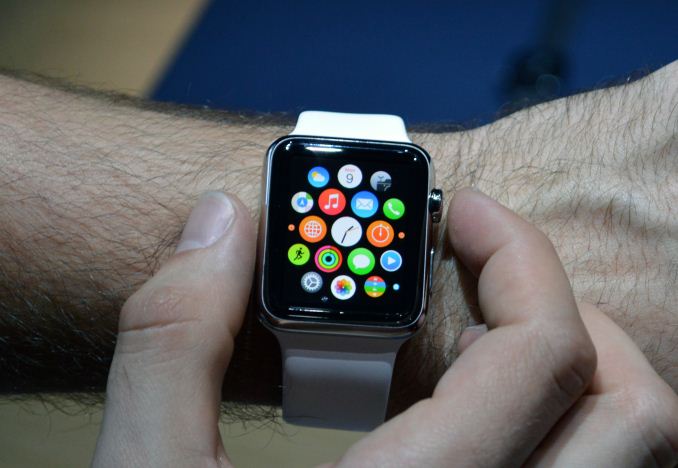
By far the highlight of Apple’s Spring Forward event was the Apple Watch. Though announced back in September, Apple has not allowed any hands-on time with the device until now. So along with finding out the full launch details today, this is the press’s first chance to actually try out what’s the first new product line from Apple in the last half-decade.
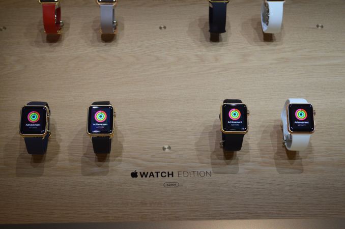
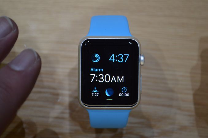
As a quick reminder, Apple is selling the watch in 2 sizes, 3 styles per size. The 38mm and 42mm sizes are essentially men’s and women’s sizes, with the 42mm carrying a general price premium of $50; and while Apple doesn’t officially mention it, we know from previous leaks of their developer guidelines that the watches have different resolutions, with the 38mm coming in at 272x340, and the 42mm at 312x390. Meanwhile the 3 oddly named styles of the watch are the entry level Apple Watch Sport, the mid-level suffix-less Apple Watch, and the luxury Apple Watch Edition. Each version of the watch moves up in material, from brushed aluminum, to polished stainless steel, to 18kt gold.
Having a chance to try the Sport edition, I’m still not entirely sure what to make of it. The Apple Watch is essentially a wrist-mounted extension for your iPhone plus a sensor suite. That gives it a lot of flexibility – Apple’s still waiting to see what developers can do with it – but it’s also clearly a first-gen Apple product looking to find its place in the world. Apple has some ideas, but long term it’s going to be developers that make or break it and they are keenly aware of that.
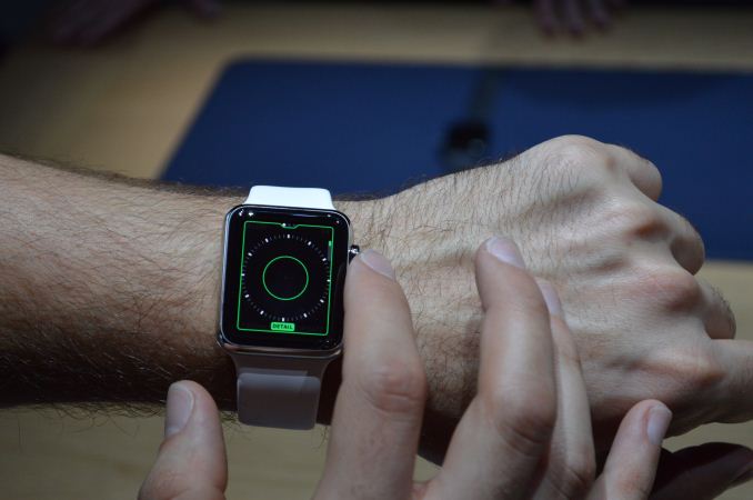
In-hand (or rather on-wrist), the size feels right, at least for someone used to wearing a sizable sports watch in the first place. Though the Sport bands Apple had on-hand did not come in a size-Ryan. Interacting with it is definitely going to be a learned art; the only physical controls are the side button and the crown, so most interaction comes from touch interactions with a fairly small screen. The Apple Watch combines traditional touch gestures with pressure gestures from their new Force Touch technology, so interactions can come from swipes or touches of various pressure.
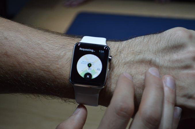
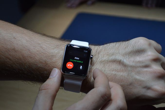
For today’s hands-on, the apps themselves are more proof of concept than real-world, as they were only setup to run through Apple’s demo material. The Watch offers an interesting selection of apps iPhone-tethered apps, shifting from a second screen for you iPhone to running scaled down versions of iPhone apps. Notifications, emails, etc can all be accessed from the Watch for communication purposes. You can also make calls from the watch, though in the admittedly crowded demo room it seemed to be a poor idea. Other apps included scaled down versions of Uber, and a scaled down version of iTunes for playing music through the Watch.
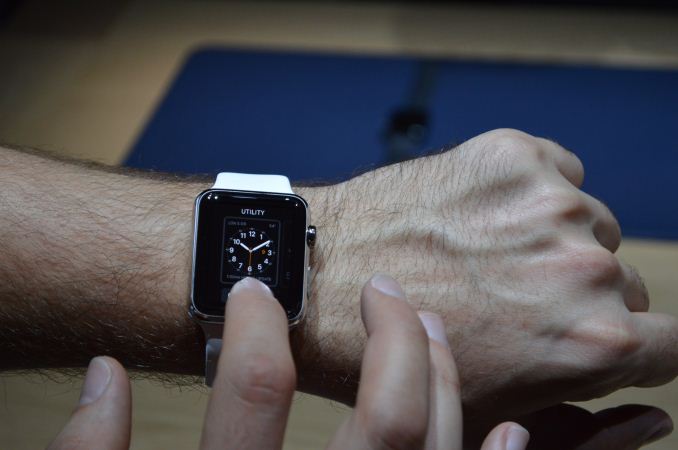
The other half of the Watch’s applications are focused on “native” functionality. This includes the actual watch face application – selectable and further customizable faces/skins of course – and applications that take advantage of the Watch’s sensor suite. The bulk of the sensor apps focus on fitness in one way or another, and this I suspect is largely due to the fact that the most “novel” sensor on the Watch is the heartrate monitor (otherwise accel/gyro are already on the iPhone). Fitbit, MS Band, and other fitness tracker users should have a good feel for what to do with this, while new users will take some guidance. Though since the interface is almost entirely iconographic, there will be a learning curve for everyone just to learn what the various icons mean and do.
The Watch appears to be running a heavily scaled down version of iOS, and in terms of performance it’s perhaps not surprising that performance feels like it’s yearning for a full Apple A-class SoC at times. Apps other than the clock – which is essentially part of the home screen – have a short but distinct loading time. Once you’re in an app most move smoothly as you’d expect, though flipping through one of the Apple fitness applications saw noticeable stuttering. Whether the load times and stuttering I saw is a limit of the SoC or the NAND I’m unsure, though as this is a pre-release device it’s entirely likely that Apple still has some performance tuning to go. What we’re seeing right now is generally going to be performant enough, but it’s not iPhone 6 level smoothness.
The million dollar (well, $10K+) question right now is this: is it worth it? That’s a question I don’t think a hands-on test in a closed environment can answer. I think it’s going to be a geek product before it goes mainstream – and this has been the case for Apple’s previous mobile products as well – as the novelty is certainly going to help get it off the ground. Whether such a watch is useful as opposed to just taking your iPhone out of your pocket is another matter; more than a few people I know gave up watches because their phone was convenient enough for a time piece, so getting them to buy back into watches is not a given, particularly since the Watch only has very limited functionality without an iPhone by its side to provide it with data (locally you have the sensor based applications, but not much more). Which isn’t to say that I’m for or again the Watch right now, only that I would need to test it at my own pace to figure out if and where it can fit into my life.
Anyhow, the Apple Watch hits retail on April 24th. So we’ll be back next month with a more comprehensive look at Apple’s latest foray into mobile.




66 Comments
View All Comments
Stuka87 - Tuesday, March 10, 2015 - link
Well, if you are actually going to be running and such, you do not WANT a steel band. You want one that is rubber. Personally I cannot stand steel bands because they always end up grabbing the hairs on my wrist.NEDM64 - Tuesday, March 17, 2015 - link
It makes sense. Aluminium is much lighter and therefore better for sports practice.The screen, not being sapphire is also better for impact resistance (but a little bit less for scratch)
Hulk - Tuesday, March 10, 2015 - link
I respect Apple for trying this but it won't catch on. There really is no use for it for most people. And the lack of a dedicated processor and short battery life will be the final stake in the heart.Perhaps at some point in the future when this can REPLACE the smart phone but not yet. The technology isn't there. And by replace I mean for those times when you don't need the larger screen of the smart phone but just the phone and the small watch display will do.
Stuka87 - Tuesday, March 10, 2015 - link
Everybody said the iPhone would be a huge flop because it didn't have a keyboard. And then they said the iPad would be a huge flop because its just a giant iPhone. We all know how those worked out.Apple has this way of creating markets that did not exist before hand.
futbalguy - Tuesday, March 10, 2015 - link
I'm a huge Apple fan and they do a great job of finding new markets but I think this product is different. At least for this first version, I dont see what the product really enables or makes more convenient.The iPhone didn't have a keyboard, but if you were to ask people at the time if they wanted to use the internet from anywhere, the answer would have been a resounding YES. That is really what the iPhone enabled and the iPad did as well.
The watch screen size will always be too small to really use the internet so it needs to offer something else. The health functionality could be the big play but I don't see enough features to get excited about in these models.
sonicmerlin - Wednesday, March 11, 2015 - link
Actually people had the same complaints about the iPad. "What's the point of a bigger iPhone when I already have a phone and laptop that can do everything the iPad can do?"It's more about the accessibility and convenience of a watch.
NEDM64 - Tuesday, March 17, 2015 - link
I remembered people saying that "I would buy a netbook instead", because the iPad didn't have USB, and Apple had to add that... among with Flash...limpy - Tuesday, March 10, 2015 - link
Hey guys! Look at this. Please help me decide.http://www.youtube.com/watch?v=kkN4KDOvFyU
NEDM64 - Tuesday, March 17, 2015 - link
Looks like a Pebble Time.But that has a better screen.
hailey14 - Wednesday, March 11, 2015 - link
Which isn’t to say that I’m for or againST the Watch right now ... typo?